Thursday, May 20, 2010

Success - and Learning from Failure

The greatest barrier to success is the fear of failure.


- Sven Goran Eriksson


Well, what a ride! I started out in January of this year proposing to do a Master's thesis as part of my degree in Professional and Technical Communication. As part of my thesis, I developed a web-based application for the assessment of student portfolios by a community of readers. Keep in mind that I hadn't programmed since my undergrad days at NJIT (25 years ago!) and so I was faced with the daunting task of becoming proficient at HTML, learning PHP, and learning MySQL. All this in the course of a few weeks so that I could actually develop the application and have it finished in time to perform usability testing and complete my thesis.


This wasn't just a theoretical application, mind you. I had to ensure that the application actually worked because it was going to be put to full use on May 13th of 2010 when the freshmen-level writing professors would be using it to score approximately 80 student portfolios.


I was terrified the night before the actual portfolio assessment session. I had visions of the application crashing and burning in all its glory. I had tested it as much as possible during development, but that's nowhere near the same as putting it out there for 20 or more professors to use in real time.


So was it a success? Yes! Did it have problems? Yes! I realized that the way I had implemented adjudications did not work based on the way the application was actually used, so I have already started to redesign that part of the application. But in general, the application performed beautifully.


So what does this all mean? It means that perseverance and the development of knowledge are just as important to defining success as a positive outcome. The application did not work flawlessly, but there were no recriminations from the professors - there were suggestions of how to make the application better, there was increased knowledge and understanding on my part, and all those factors together point to the fact that the entire experience was a success.


In fact, it was such a success that I have now graduated from NJIT with my Master of Science in Professional and Technical Communication, and I am subsequently applying for admission to NJIT's PhD program in Information Systems. I'm sure that experience will generate even more posts to this blog, so wish me luck!

Thursday, February 18, 2010

Designing an Assessment Application

Don't make something unless it is both necessary and useful; but if it is both necessary and useful, don't hesitate to make it beautiful.


- Shaker Philosophy


I've been fairly quiet again, but it's not because I don't care about you, my readers. I've just been really busy trying to work on my thesis proposal. Now that the proposal is in good shape, I'm doing rapid prototyping for my application to work on the HTML screens. I'm going to post them here (there are quite a few) in the hopes that I can get some feedback on usability design. These are non-functioning HTML pages - there are no active links. And I know the design is very simple, but my development cycle is quite compressed so I don't have a lot of time to make it "pretty" right now.


So here are the pages - let me know what you think.


This is the Welcome Page that users will see when they start the web-based application.


They then move on to the Login page, where both raters and administrators can log into the application.


From here the screens divide into two components: screens for the raters and screens for the administrators. I'll handle the screens for the raters first.


The first thing a rater does once he or she has logged in is to select a student to rate using this page.


Depending on the section being rated, the rater will then be presented with one of three scoring rubrics: Humanities 101, Humanities 352, and graduate level MSPTC.


The rater must submit a score for each variable on the rubric unless the rater is adjudicating, but more on that in a minute.


When the rater submits the completed rubric, she is presented with choices for the next action, as shown on this page.


If the rater chooses to log out, she is presented with a screen asking if she is sure she wants to log out. If she answers yes, she is logged out and thanked for her time and efforts on a final screen.


If the rater chooses to rate another student, he goes back to the page to select the next student to rate.


Now, from the administrator side of the application, there are more functions available. When an administrator logs on, she is presented with the administrator screen listing possible actions. I'll step through each of these actions in order.


The Begin Assessment screen lets the administrator start the "official" rating period. Prior to that, any scores entered are not stored in the database. This is useful for the purposes of training the raters prior to starting the actual assessment.


If a faculty member walks into the assessment room and asks to be a rater, the administrator can use the Add New Rater screen to add that faculty member to the list of raters. Similarly, if a student knocks on the door and hands the administrator a last-minute portfolio for scoring, the admin can use the Add New Student screen to add that student to the list to be rated.


Each portfolio is rated by two raters. But if there's scores don't match or aren't adjacent (within one point of each other), we assign a third reader, called an adjudicator, to break the tie, so to speak. The administrator can find the portfolios that need an adjudicator and then assign them using this screen. Note that the adjudicator only provides scores for the variables requiring adjudication.


The administrator can also monitor scores to evaluate the ongoing assessment process. Using the View Reports screen, the admin can select different types of reports to view.


  • View Report by Student lets the admin look at the scores from all raters for a particular student.

  • View Report by Rater lets the admin look at the scores being assigned by a particular rater.

  • View Report by Variable lets the admin see a bar chart of the distribution of scores for any particular variable from the rubric.

  • View Records Requiring Adjudication lets the admin see all records that needed adjudication, whether the adjudication was already completed or not. This is useful for identifying any raters who are consistently requiring adjudication.


Once the assessment is over, the administrator can export the data for analysis using either the SPSS or SAS software package by making the appropriate selection on the Export Data page.


That's the design of the application as it currently stands, which is still in the early stages. I look forward to your feedback.

Friday, January 8, 2010

Stereotype Threat - What Every Minority Should Know


The emotional, sexual, and psychological stereotyping of females begins when the doctors says: "It's a girl."


- Shirley Chisholm


I was doing a literature search for a research proposal and I came across a most fascinating study. Published in 1999 in the Journal of Experimental Social Psychology (volume 35, pages 4-28), it documents research performed by Steven Spencer, Claude Steele and Diane Quinn regarding something they call stereotype threat. They define stereotype threat as "the experience of being in a situation where one faces judgment based on societal stereotypes about one's group..."


It's really a fascinating study - one that every minority should read. To summarize what was a very involved study, the researchers found that when men and women took an easy math test, they scored about the same. But when the test was difficult, women scored significantly lower than men.


This might make you think, "Aha - so it's true that men are better at math than women!" But you'd be wrong. Because in a second portion of the study, the researchers showed that stereotype threat was the real culprit behind the significant difference in performance. In this second study, all groups were given the difficult math test. But some groups were told ahead of time that previous tests had shown gender differences (thereby reinforcing the stereotype threat), and other groups were told that the test had never shown any gender differences in the past.


  • The groups in which the stereotype threat was reinforced showed a significant difference (almost 20%) in scores between men and women.

  • In the groups who were told no gender differences existed, the scores for men and women were almost identical.


Fascinating, isn't it? So the next time you hear someone tell you men are simply better at math, or some other ignorant stereotype, don't believe them, and certainly don't let it impact your own performance!

Saturday, December 12, 2009

Life Happens...

Change is inevitable - except from a vending machine.


- Robert C. Gallagher


My post on December 4th talked about my evolution as a blogger. But what it really looked at was the visual evolution of the design of my blog. Although I talked a little bit in there about how my tone has gotten more conversational, really my main focus was to show how I've tried out different blog templates (kind of how teenagers try on different personalities). I still don't think I'm done changing the way my blog looks, so don't be surprised if you check back in and it looks different again...


What about the main topic of my blog? When I first started, I envisioned I'd be writing mostly about women in technology because that's kind of a pet project of mine. Well, if you read my posts, I've tried to go back to that topic every so often, but somehow, I keep getting sidetracked. And isn't that kind of how life works? We start out down one road or one thought process and we find ourselves on some detour.


That's not to say that the detours aren't beneficial. Sometimes you discover new places (or new things about yourself) by taking a detour. In my last posting, I described stepping outside of my comfort zone to design a social media strategy for defero. When I started this blog in September, I never dreamed I'd be blogging about something like that! Or about the Z pattern in eye movements, for that matter. But even though I've wandered around a bit in terms of topics, you can still get a good sense of who I am by reading my posts.


When I first started writing my blog, I tended to write in a formal tone because that's what I was used to doing in my job. But I've tried to relax a bit, and now I try to write my postings as if I'm writing an e-mail to a friend, not posting thoughts to a blog for public consumption. I hope you've noticed and enjoyed the difference.


I've also gone back and forth with being worried about the length of my blog postings. At first, I tried to make sure I covered every point I wanted to make, but then my postings got a little long. So the next few postings got short - maybe even too short - as I tried to really cut back on what I wrote to keep the postings to a reasonable length. Now I've gotten to the point where I'm confident enough to write what I want to say and not worry so much about the length of the posting.


So where do I (and my blog) go from here? I hope to get back more to my topic of interest: trying to encourage girls to pursue careers in science and technology and discussing why women so frequently drop out of those careers. But like my title says, life happens, and who knows where the next detour will lead me? Or, as one of my favorite poems from The Lord of the Rings says:


The Road goes ever on and on

Down from the door where it began.

Now far ahead the Road has gone,

And I must follow, if I can,

Pursuing it with eager feet,

Until it joins some larger way

Where many paths and errands meet.

And whither then? I cannot say.


- J. R. R. Tolkien


Illustration copied without permission from www.coldal.org/quotes.html

Friday, December 11, 2009

Coloring Outside My Lines

Accessible design is good design.


- Steve Ballmer


I recently had an opportunity to expand my horizons in the area of design. I was asked to create a strategy for the launch of a social media company called defero. It's a startup communications company made up of individuals from "old media" who want to use their skills in the Web 2.0 world. My job was to create an all-encompassing social media strategy for them.


The first thing I did was decide how I was going to present my proposal to the management team at defero. I decided to use a blog for two reasons. First, it's a great way to show the defero team the power of blogs and how simple they are to create. Second, it gave me a central location in which to present my proposed deliverables: blog, website, wiki, podcasts, and videos. You can take a look at my blog by clicking here.


Once I had decided to create a blog, I then created the logo. I needed to create the logo first in order to establish the design theme for the social media deliverables. In looking at my logo, I believe that I am somewhat of a minimalist at heart. I went with something clean and simple - I chose a sans serif font because that's the preferred type of font for viewing online, and the arcs over the "o" are reminiscent of the RSS feed symbol and imply broadcasting or transmission of information.


After the logo, I next created my proposal blog. I created individual postings for each deliverable so that I could provide detailed information for each item: the blog, the website, the videos, the podcasts, and the wiki. I also created an introductory posting with links to the individual posts, and an overview posting with general strategy information.


In designing the deliverables, I maintained not only the color scheme of the logo (black/red) but also the minimalist, clean look. I felt that defero would beenfit from an uncluttered look so that clients could focus on the particular areas of social media in which defero excels. For example, here is an illustration of one page of the defero website.


I also created storyboards for defero's blog and wiki, and I provided topics for podcasts and videos. I am very excited to be presenting my proposal to defero and I look forward to working with them on this project.


So why did I use the title "Coloring Outside My Lines" for this posting? Because this has all been a new experience for me. My experience in the past has been mainly in product documentation. Sure, I've designed covers for documentation and helped with product packaging design, but I'd never created a logo before, or designed a website other than my own. It was a challenge, and I hope that my design proposal is well received. While it's intimidating to step outside of my comfort zone, it's also been an exciting learning experience for me, and I look forward to more of these types of opportunities in the future.

Monday, December 7, 2009

Collaboration - Help or Hindrance?


Snowflakes are one of nature's most fragile things, but just look what they can do when they stick together.


- Vesta M. Kelly



Are you an optimist like Vesta M. Kelly, or are you more of a pessimist like the people at despair.com? I suppose your point of view really depends on your experiences with collaboration. But let's face it, in this day and age, we really do have to learn to work together to get things done.
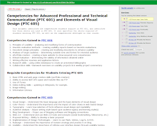


Have you ever heard of something called writeboard? It's a web-based application that lets you invite people to collaborate on a document with you. You give them a link and a password and they can all log in and work on the document. The nice thing is that writeboard saves all previous versions of the document, so you can go back to any previous iteration if you don't like some of the recent changes that were made. And each contributor can write a comment on what he or she added, so you can stay on top of the modifications. It's a really cool idea, and the designers have made it easy to use. That being said, however, I can't imagine writing documents of any length or working over an extended period of time - the versions and comments might get overwhelming.


I was recently invited to collaborate on a short document using writeboard. There was a very basic outline provided by the person initiating the collaboration, and our team was asked to fill in the outline. Writeboard made it easy to add information to the document, but even then, collaboration was a little tricky. For example, someone had previously added a bullet to a list, and I wasn't sure what that bullet meant. But I didn't know if I should delete it or leave it. I ended up leaving it there with a comment that I didn't know what they meant by it. That person didn't respond, so a later collaborator ended up deleting that bullet item. These are the kinds of problems you might encounter in small-scale collaboration.
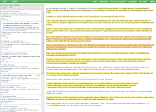


If you're a professional communicator, you should check out co-ment. It's another web-based application, but this one is for text annotation, not text creation/revision. I think co-ment would be really useful for distributing a document to a selection of reviewers. That way you could have all of their comments in one place instead of spread out over several copies of your document. Co-ment would make it much easier to incorporate reviewer comments into your document.


So why collaborate on a document at all? As Tom Clancy said, "Collaboration on a book is the ultimate unnatural act." As a famous author, he had the luxury of working alone and on his own schedule. But for the rest of us communication professionals, we often find ourselves in a situation of having to collaborate at one level or another on documents.


Collaborating on documents can be tricky. People have different writing styles and different ideas of how information should be presented. So the first rule of collaboration has to be creating well-defined tasks for the individuals in the group. And in general it's much more effective to have each person responsible for a complete deliverable, not portions of a deliverable. In other words, it's awfully hard to get people to write sections of a a single chapter, but asking each person to submit a chapter in a book is actually done a lot. That way the person gets closure - they get to write the introduction, the body of the document, and the summary. The collaboration will come in making sure your chapter fits with everyone else's, and reviewing all the chapters to make sure the document makes sense overall.


Another benefit to having well-defined tasks is evaluation. The project leader, the manager, the professor - whoever has to evaluate the completed work has to know which parts were submitted by whom. Otherwise there's no accountability. Similarly, the team needs to know that everyone is carrying their own weight and no one is slacking off or taking credit for something they didn't do. The situation reminds me of a rookie quarterback who shall remain nameless: when his team wins, he takes a lot of the credit, but when they lose, it's the team's fault.


So why bother at all? Because collaboration can actually produce a much more complete document. Everyone has specialized knowledge these days, and by collaborating, you can make sure you cover all the bases. If one person overlooks or omits something, someone else on the team is likely to include that information or make it clearer or better.


Okay, so I've given my views on collaborating on documents. What about other types of collaboration, like sharing ideas in forums? To be honest, I see only positive results from that type of collaboration. Sharing knowledge and ideas is a great way to expand your horizons, to learn new things, to gain new insights... I have been involved in a lot of discussion forums about all kinds of communication topics, especially while a student at NJIT. I am amazed at how much I still don't know and how on top of things my classmates are. Reading their opinions makes me go back and reevaluate my own opinions on things. Forums are a really great way to share information.


What about chat rooms? I've had mixed experiences with that. One problem is that, because chat rooms are synchronous, I have to be available (and remember to go sit at the computer) at the scheduled time, and that is often a problem for me. And sometimes chat rooms can turn into social sessions instead of collaboration meetings. But when you have a chat moderator or someone who is tasked with keeping the group focused, a chat room can be really helpful, especially if there are things you don't understand, because you can keep asking more and more specific questions until you eventually drill down to your area of confusion.


The main downside to chat rooms is that if you get too many people involved, the meeting can become a mess of people "chatting" over each other. We used chat in my Corporate Communication course when my four-person advertising group had to meet, and it worked out really well. But when we invited the other group and ended up with eight people in the chat room, we got very little accomplished.


In my course on the Elements of Visual Design, we had some opportunities to work collaboratively with other students, but there were a few reasons I shied away from that. First, I wasn't exactly sure how the evaluation part of the collaborative effort would work out. For example, if I created a blog and the other person created a website, wouldn't the website be a lot more work? Would I therefore get a lower grade because my effort would be less? (Now that I'm almost done, though, I don't think that would have been the case - it's all a lot of work!) Also, I only really knew one other person in the class with whom I would consider collaborating, but she had already chosen to develop the same type of social media (blog) as I had chosen... And as a student, I was concerned not knowing my other classmates very well that there might be conflict either in aspects of design or timeliness of deliverables, and so I chose to go it on my own. I might still "collaborate" somewhat by providing links from my blog to another student's work, but that's collaboration on my terms, which isn't really collaboration at all, I guess...


Friday, December 4, 2009

My Evolution as a Blogger

All that is valuable in human society depends upon the opportunity for development accorded the individual.


- Albert Einstein


The other day, someone I work with was doing a search on the internet for the terms technical communication and social networking. As I sat in her office, she said, "Oh, here's something that sounds interesting. It's called A Woman In Technology!" I laughed and said, "That's my blog!"


I started this blog in September of this year, and I am very willing to admit that I had not really blogged before. Actually, I had created a blog for a class I took on Corporate Communication, but I wasn't really sure what I was supposed to be doing with it so my posts were kind of random and short.


This time, however, I've really started to enjoy blogging. In fact, I even got my husband to start a blog about his restoration of arcade-style video games - he calls it My Garage Arcade. But back to me and my evolution as a blogger.


As you can see in this illustration, my initial blog was pretty traditional and my tone tended to be more formal (limited use of contractions and so on). I was kind of torn about the width of the blog, however, because my posts were a little long and I (personally) hate having to scroll a lot. I therefore next tried a blog format with a wider post area.


I liked this template because it had the wider posting area. I also like the fact that the titles on the right side of the blog have bars that give that area a nice definition. I played around with the colors because I didn't like the background pure white as it looked too stark, so I went with a grey. I liked the fact that, with this format, more of my posting was visible on the screen at any given time, so my readers wouldn't have to scroll as much.


What I didn't like about the previous format was that my posting titles were really boring - they weren't eye catching at all. So I decided to try something different. I stayed with a template that had the wider posting area, but I found one that really highlighted my post titles - I felt that really made them stand out and gave them a nice delineation. The purple was just something I played around with because I wanted to try some fun colors to liven the blog up a bit.


Then I saw one of my classmates' blogs using a different template that I really liked. Although it has the narrower posting area, I really like the way the dark background made the text stand out. In fact, I like this template so much that, when my husband created his blog, I told him to use this template, although he's using the original colors while I played around with the colors for my blog. At this point, I also started to feel more comfortable with using a more relaxed, conversational tone.


Still, I didn't like the fact that the narrow posting area made my posts look so very long, so I went back to a template with a wider posting area. I tried to stay away from the stark white background by using grey again, but it just looked dull. I used it for a while, as you can see, but since then I've modified my blog to look the way it does now.


I'm still evolving as a blogger - I envision more changes to come - but this post shows you where I started and where I ended up three months later. Not bad for a first-time blogger, huh?