Saturday, December 12, 2009

Life Happens...

Change is inevitable - except from a vending machine.


- Robert C. Gallagher


My post on December 4th talked about my evolution as a blogger. But what it really looked at was the visual evolution of the design of my blog. Although I talked a little bit in there about how my tone has gotten more conversational, really my main focus was to show how I've tried out different blog templates (kind of how teenagers try on different personalities). I still don't think I'm done changing the way my blog looks, so don't be surprised if you check back in and it looks different again...


What about the main topic of my blog? When I first started, I envisioned I'd be writing mostly about women in technology because that's kind of a pet project of mine. Well, if you read my posts, I've tried to go back to that topic every so often, but somehow, I keep getting sidetracked. And isn't that kind of how life works? We start out down one road or one thought process and we find ourselves on some detour.


That's not to say that the detours aren't beneficial. Sometimes you discover new places (or new things about yourself) by taking a detour. In my last posting, I described stepping outside of my comfort zone to design a social media strategy for defero. When I started this blog in September, I never dreamed I'd be blogging about something like that! Or about the Z pattern in eye movements, for that matter. But even though I've wandered around a bit in terms of topics, you can still get a good sense of who I am by reading my posts.


When I first started writing my blog, I tended to write in a formal tone because that's what I was used to doing in my job. But I've tried to relax a bit, and now I try to write my postings as if I'm writing an e-mail to a friend, not posting thoughts to a blog for public consumption. I hope you've noticed and enjoyed the difference.


I've also gone back and forth with being worried about the length of my blog postings. At first, I tried to make sure I covered every point I wanted to make, but then my postings got a little long. So the next few postings got short - maybe even too short - as I tried to really cut back on what I wrote to keep the postings to a reasonable length. Now I've gotten to the point where I'm confident enough to write what I want to say and not worry so much about the length of the posting.


So where do I (and my blog) go from here? I hope to get back more to my topic of interest: trying to encourage girls to pursue careers in science and technology and discussing why women so frequently drop out of those careers. But like my title says, life happens, and who knows where the next detour will lead me? Or, as one of my favorite poems from The Lord of the Rings says:


The Road goes ever on and on

Down from the door where it began.

Now far ahead the Road has gone,

And I must follow, if I can,

Pursuing it with eager feet,

Until it joins some larger way

Where many paths and errands meet.

And whither then? I cannot say.


- J. R. R. Tolkien


Illustration copied without permission from www.coldal.org/quotes.html

Friday, December 11, 2009

Coloring Outside My Lines

Accessible design is good design.


- Steve Ballmer


I recently had an opportunity to expand my horizons in the area of design. I was asked to create a strategy for the launch of a social media company called defero. It's a startup communications company made up of individuals from "old media" who want to use their skills in the Web 2.0 world. My job was to create an all-encompassing social media strategy for them.


The first thing I did was decide how I was going to present my proposal to the management team at defero. I decided to use a blog for two reasons. First, it's a great way to show the defero team the power of blogs and how simple they are to create. Second, it gave me a central location in which to present my proposed deliverables: blog, website, wiki, podcasts, and videos. You can take a look at my blog by clicking here.


Once I had decided to create a blog, I then created the logo. I needed to create the logo first in order to establish the design theme for the social media deliverables. In looking at my logo, I believe that I am somewhat of a minimalist at heart. I went with something clean and simple - I chose a sans serif font because that's the preferred type of font for viewing online, and the arcs over the "o" are reminiscent of the RSS feed symbol and imply broadcasting or transmission of information.


After the logo, I next created my proposal blog. I created individual postings for each deliverable so that I could provide detailed information for each item: the blog, the website, the videos, the podcasts, and the wiki. I also created an introductory posting with links to the individual posts, and an overview posting with general strategy information.


In designing the deliverables, I maintained not only the color scheme of the logo (black/red) but also the minimalist, clean look. I felt that defero would beenfit from an uncluttered look so that clients could focus on the particular areas of social media in which defero excels. For example, here is an illustration of one page of the defero website.


I also created storyboards for defero's blog and wiki, and I provided topics for podcasts and videos. I am very excited to be presenting my proposal to defero and I look forward to working with them on this project.


So why did I use the title "Coloring Outside My Lines" for this posting? Because this has all been a new experience for me. My experience in the past has been mainly in product documentation. Sure, I've designed covers for documentation and helped with product packaging design, but I'd never created a logo before, or designed a website other than my own. It was a challenge, and I hope that my design proposal is well received. While it's intimidating to step outside of my comfort zone, it's also been an exciting learning experience for me, and I look forward to more of these types of opportunities in the future.

Monday, December 7, 2009

Collaboration - Help or Hindrance?


Snowflakes are one of nature's most fragile things, but just look what they can do when they stick together.


- Vesta M. Kelly



Are you an optimist like Vesta M. Kelly, or are you more of a pessimist like the people at despair.com? I suppose your point of view really depends on your experiences with collaboration. But let's face it, in this day and age, we really do have to learn to work together to get things done.
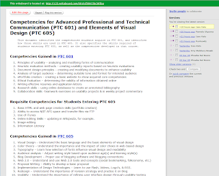


Have you ever heard of something called writeboard? It's a web-based application that lets you invite people to collaborate on a document with you. You give them a link and a password and they can all log in and work on the document. The nice thing is that writeboard saves all previous versions of the document, so you can go back to any previous iteration if you don't like some of the recent changes that were made. And each contributor can write a comment on what he or she added, so you can stay on top of the modifications. It's a really cool idea, and the designers have made it easy to use. That being said, however, I can't imagine writing documents of any length or working over an extended period of time - the versions and comments might get overwhelming.


I was recently invited to collaborate on a short document using writeboard. There was a very basic outline provided by the person initiating the collaboration, and our team was asked to fill in the outline. Writeboard made it easy to add information to the document, but even then, collaboration was a little tricky. For example, someone had previously added a bullet to a list, and I wasn't sure what that bullet meant. But I didn't know if I should delete it or leave it. I ended up leaving it there with a comment that I didn't know what they meant by it. That person didn't respond, so a later collaborator ended up deleting that bullet item. These are the kinds of problems you might encounter in small-scale collaboration.
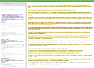


If you're a professional communicator, you should check out co-ment. It's another web-based application, but this one is for text annotation, not text creation/revision. I think co-ment would be really useful for distributing a document to a selection of reviewers. That way you could have all of their comments in one place instead of spread out over several copies of your document. Co-ment would make it much easier to incorporate reviewer comments into your document.


So why collaborate on a document at all? As Tom Clancy said, "Collaboration on a book is the ultimate unnatural act." As a famous author, he had the luxury of working alone and on his own schedule. But for the rest of us communication professionals, we often find ourselves in a situation of having to collaborate at one level or another on documents.


Collaborating on documents can be tricky. People have different writing styles and different ideas of how information should be presented. So the first rule of collaboration has to be creating well-defined tasks for the individuals in the group. And in general it's much more effective to have each person responsible for a complete deliverable, not portions of a deliverable. In other words, it's awfully hard to get people to write sections of a a single chapter, but asking each person to submit a chapter in a book is actually done a lot. That way the person gets closure - they get to write the introduction, the body of the document, and the summary. The collaboration will come in making sure your chapter fits with everyone else's, and reviewing all the chapters to make sure the document makes sense overall.


Another benefit to having well-defined tasks is evaluation. The project leader, the manager, the professor - whoever has to evaluate the completed work has to know which parts were submitted by whom. Otherwise there's no accountability. Similarly, the team needs to know that everyone is carrying their own weight and no one is slacking off or taking credit for something they didn't do. The situation reminds me of a rookie quarterback who shall remain nameless: when his team wins, he takes a lot of the credit, but when they lose, it's the team's fault.


So why bother at all? Because collaboration can actually produce a much more complete document. Everyone has specialized knowledge these days, and by collaborating, you can make sure you cover all the bases. If one person overlooks or omits something, someone else on the team is likely to include that information or make it clearer or better.


Okay, so I've given my views on collaborating on documents. What about other types of collaboration, like sharing ideas in forums? To be honest, I see only positive results from that type of collaboration. Sharing knowledge and ideas is a great way to expand your horizons, to learn new things, to gain new insights... I have been involved in a lot of discussion forums about all kinds of communication topics, especially while a student at NJIT. I am amazed at how much I still don't know and how on top of things my classmates are. Reading their opinions makes me go back and reevaluate my own opinions on things. Forums are a really great way to share information.


What about chat rooms? I've had mixed experiences with that. One problem is that, because chat rooms are synchronous, I have to be available (and remember to go sit at the computer) at the scheduled time, and that is often a problem for me. And sometimes chat rooms can turn into social sessions instead of collaboration meetings. But when you have a chat moderator or someone who is tasked with keeping the group focused, a chat room can be really helpful, especially if there are things you don't understand, because you can keep asking more and more specific questions until you eventually drill down to your area of confusion.


The main downside to chat rooms is that if you get too many people involved, the meeting can become a mess of people "chatting" over each other. We used chat in my Corporate Communication course when my four-person advertising group had to meet, and it worked out really well. But when we invited the other group and ended up with eight people in the chat room, we got very little accomplished.


In my course on the Elements of Visual Design, we had some opportunities to work collaboratively with other students, but there were a few reasons I shied away from that. First, I wasn't exactly sure how the evaluation part of the collaborative effort would work out. For example, if I created a blog and the other person created a website, wouldn't the website be a lot more work? Would I therefore get a lower grade because my effort would be less? (Now that I'm almost done, though, I don't think that would have been the case - it's all a lot of work!) Also, I only really knew one other person in the class with whom I would consider collaborating, but she had already chosen to develop the same type of social media (blog) as I had chosen... And as a student, I was concerned not knowing my other classmates very well that there might be conflict either in aspects of design or timeliness of deliverables, and so I chose to go it on my own. I might still "collaborate" somewhat by providing links from my blog to another student's work, but that's collaboration on my terms, which isn't really collaboration at all, I guess...

Friday, December 4, 2009

My Evolution as a Blogger

All that is valuable in human society depends upon the opportunity for development accorded the individual.


- Albert Einstein


The other day, someone I work with was doing a search on the internet for the terms technical communication and social networking. As I sat in her office, she said, "Oh, here's something that sounds interesting. It's called A Woman In Technology!" I laughed and said, "That's my blog!"


I started this blog in September of this year, and I am very willing to admit that I had not really blogged before. Actually, I had created a blog for a class I took on Corporate Communication, but I wasn't really sure what I was supposed to be doing with it so my posts were kind of random and short.


This time, however, I've really started to enjoy blogging. In fact, I even got my husband to start a blog about his restoration of arcade-style video games - he calls it My Garage Arcade. But back to me and my evolution as a blogger.


As you can see in this illustration, my initial blog was pretty traditional and my tone tended to be more formal (limited use of contractions and so on). I was kind of torn about the width of the blog, however, because my posts were a little long and I (personally) hate having to scroll a lot. I therefore next tried a blog format with a wider post area.


I liked this template because it had the wider posting area. I also like the fact that the titles on the right side of the blog have bars that give that area a nice definition. I played around with the colors because I didn't like the background pure white as it looked too stark, so I went with a grey. I liked the fact that, with this format, more of my posting was visible on the screen at any given time, so my readers wouldn't have to scroll as much.


What I didn't like about the previous format was that my posting titles were really boring - they weren't eye catching at all. So I decided to try something different. I stayed with a template that had the wider posting area, but I found one that really highlighted my post titles - I felt that really made them stand out and gave them a nice delineation. The purple was just something I played around with because I wanted to try some fun colors to liven the blog up a bit.


Then I saw one of my classmates' blogs using a different template that I really liked. Although it has the narrower posting area, I really like the way the dark background made the text stand out. In fact, I like this template so much that, when my husband created his blog, I told him to use this template, although he's using the original colors while I played around with the colors for my blog. At this point, I also started to feel more comfortable with using a more relaxed, conversational tone.


Still, I didn't like the fact that the narrow posting area made my posts look so very long, so I went back to a template with a wider posting area. I tried to stay away from the stark white background by using grey again, but it just looked dull. I used it for a while, as you can see, but since then I've modified my blog to look the way it does now.


I'm still evolving as a blogger - I envision more changes to come - but this post shows you where I started and where I ended up three months later. Not bad for a first-time blogger, huh?

Sunday, November 29, 2009

Eye Tracking in Design - Why Does It Matter?

It's not what you look at that matters, it's what you see.


- Henry David Thoreau


One of my favorite hobbies is scrapbooking. Instead of putting my photos in a photo album, I create decorative scrapbook pages with my photos. Through my scrapbooks, I am trying to enhance the experience of looking at the photos and also to provide more information about the event by including journaling. Recently I started working on what's called a heritage album - an album of my ancestors. I actually have a few treasured photos of my great grandmother and my great-great grandmother, shown in the photo below.


When I first started scrapbooking, I thought it was just a fun hobby, but there are people who take it very seriously. There are numerous magazines devoted to the topic. There are different types of scrapbooking: traditional, digital, and hybrid. And there are lots of articles and websites and even entire books about designing scrapbook pages. One of the first design rules I learned when scrapbooking was that people's eyes tend to move over a page in a Z pattern: they start at the top left, move across the top to the far right, then they scan diagonally back across to the lower left and then back across to the lower right. Here's a link to a scrapbook design blog that talks about the Z flow.


So how, you might ask, do we know that people's eyes move that way? From the study of eye tracking. Think about it – all day long, whenever you are actively engaged in something, your eyes are tracking. When you’re driving, your eyes are looking at the road in front of you, at traffic signals and cars entering the roadway… When you are eating, your eyes are looking at your food, analyzing color and texture that can either add to or detract from your overall dining experience. When you are reading, your eyes are tracking the printed word across the page. And when you are working on a computer, your eyes are scanning the text and images presented to you on your screen. By studying how our eyes track, we can gain very useful information about whether or not something is easy to use, clearly presented, or visually appealing.


There are two ways that researchers gather data about eye tracking. In the head-mounted system, they mount a particularly unattractive device on your head that measures your “pupil glint” from different angles to see what your eyes are focusing on. The other method uses a remote camera to track the orientation of your eye. Either way, the information the researchers collect can be pretty useful.


For example, researchers in the 1950s studied the eye movements of airplane pilots to see where their eyes moved during the difficult process of landing a plane. Based on their research, airplane manufacturers actually redesigned the instrument layout in the cockpit, and since then, instrument usability has improved and incidents of human error have decreased. I’d say that’s a pretty good tradeoff for having to wear some awkward headgear for a while.


Eye tracking studies have also been done on how people read printed material. In normal situations, studies have shown that readers typically skip words that are three letters or less, and instead read groups of words, not single words one at a time. But when the material gets complex, our reading speed slows down and we reread phrases more frequently. The other factor that can impact our reading speed is fonts. Eye tracking studies have shown that we do best with printed 9 to 12 point fonts with serifs. Anything smaller and we have a problem reading; anything larger and we can’t read words in groups.


So, as you can see, eye tracking really does give us a lot of useful information. What kind of information does it collect? In technical jargon, the data is called fixations and saccades. A fixation occurs when your eye is focused on a particular point, while saccades move the eye from one fixation point to the next. By looking at the organization and duration of fixations and saccades, researchers can identify scanpaths like the Z pattern I learned about through scrapbooking.


From a web design point of view, eye tracking can tell us a lot about the usability of our design. For example, the state of Washington performed an eye-tracking study on their Department of Licensing website. The people in the study were asked to perform certain functions, one of them being finding information about a motorcycle permit. Through eye tracking, the researchers found that several of the study participants scanned the Quick clicks section, even though the information wasn’t there. Knowing this, the Department of Licensing could redesign the Quick clicks to include motorcycle permit information, because obviously several people thought it should be there, even if they didn’t verbalize that assumption.


What about something like footnotes? We’re all used to reading them in print. But what happens when we’re reading online? Eye tracking studies have shown that people don’t read the information if it’s at the bottom of the screen, but they’ll read it if it’s near its reference. What other design guidelines has eye tracking given us? Here are some of the key ones as outlined in an article called “Eye Tracking: How It Works and How It Relates to Usability” by Lynne Cooke (published in the Technical Communication journal, Volume 52, Number 4, November 2005).


  • Eye movements roughly follow the “Z” pattern of design.

  • Small type encourages focused reading, while large type promotes scanning.

  • Underlined headlines create a visual barrier stopping people from reading what’s below the line.

  • Short paragraphs are better than long paragraphs.

  • Headlines with a summary attract viewers and keep them reading.

  • Images should be at least 210 x 230 pixels in order to grab viewers’ attention.


So the next time you’re developing a website or some other online document, remember to think about where you want your viewers’ eyes to go and make sure you design with that in mind.

Wednesday, November 4, 2009

Creating a Training Website - Insight and Hindsight

Good teaching is one-fourth preparation and three-fourths theater.


- Gail Godwin


To get back to my focus regarding women and technology, I want to write a bit about a training website I created for the NJIT ADVANCE grant that focuses on connecting women researchers in science and engineering to each other, to their male peers, and to their female counterparts in industry and government. You can access the website at sites.google.com/site/advancetrainingsite/.


Here is a screenshot of the home page of the training website.


And here is a picture of what the NJIT ADVANCE grant is examining – NJIT faculty social networks based on coauthorship of publications.


Although I created this website as an exercise for a web design class, it is actually going to be useful to the NJIT ADVANCE grant team. All the information on data conversion, as well as the sample files I provided so trainees could practice the steps themselves, are all real and correct. In fact, Dr. Nancy Steffen-Fluhr, the PI on the grant, is already planning to use it to train some new team members. Which means I should be getting some good usability feedback!


How did I come up with the design, you might ask? Well, I had some assumptions about my trainees that helped me design the website more effectively. For example, my learners are primarily verbal, so they prefer textual explanations rather than complex diagrams. I therefore focused on documenting the steps, providing links to visuals if the learner wants to view them. The visuals are annotated to make sure the learner knows what he or she is looking at.


My learners are more reflective than active, meaning that they like to think through a problem before jumping right in to solve it. So I documented all the steps and provided sample files so the learners could actually try the steps whenever they felt ready.


Luckily, my trainees are more sequential thinkers than global thinkers. That fits well with the entire concept of the site which is very sequential – the steps need to be performed in a certain order, and that is how they are documented. I don’t provide links for the trainees to jump around within modules because that would really mess up the data conversion.


And finally, my learners are more intuitive than sensing. What does that mean? It means they like to learn abstract concepts rather than necessarily real-life examples. To address this preference, I tried to explain the why of the steps instead of just the implementation.


In terms of the overall design of the site, I worked with the red and blue colors to maintain a coherent identity with NJIT (red) and the ADVANCE logo (blue and red). I provided a single page that contains all the formulas so that learners could reference it easily even after they are confident that they know all the steps. They can also print out the formula page and have it as a reference. I also provided a page with software requirements, including a link to the Analytic Technologies site where the learner can download UCINet 6 as a free trial version.

Wednesday, October 28, 2009

Automobiles - It's All About the Image

A suburban mother's role is to deliver children obstetrically once, and by car forever after.


- Peter De Vries


For the last 19 years, I've been relegated to mom-mobiles so I could drive around my four kids and their friends. But now that I have two young adult drivers, I found myself looking for a small, fuel-efficient car to do my everyday driving. The question was, what car to get?


I started looking around on the road for cars that I liked. I saw one that had the Kia logo on it, so I went to the Kia website. Turns out the car I saw was the Kia Soul.


When I go to the website, I don't just see a picture of the car. I get a flash "tour" - I can rotate the car to get different views, along with images of the interior and options. The website designers also made sure to include important facts on the image - things to make me keep looking - like the economical base price and the 5 star safety rating. With cars, it's all about image, isn't it? Speaking of image, if I could afford a Mercedes, here's the car I see on their international website.


Nice, huh? Just a little out of my price range, though...


Images, illustrations, symbols - we're surrounded by them every day to the point where we don't even know that we know them. I mean, we all know the automotive manufacturer symbols: Mercedes-Benz, Honda, Subaru, Chevy. They are some of the most recognized symbols in the world.


Let's look at another company that's famous for its look and logo - Apple, Inc. Apple frequently changes their homepage design, but on the day I visited, here's what it looked like.


Pretty striking, huh? It's still got the Apple look and feel - lots of white space, clean, uncluttered. All your navigation is done by clicking on the images on the screen, or by using the unobtrusive menu bar at the top of the page.


They have a link to the popular Mac vs. PC ads, but again, the title is unobtrusive. They offer a video for the iMac, but they don't force you to play it every time you visit the page. So not only is their logo famous, but their look and feel immediately tells you it's Apple, and their navigation is simple and streamlined, using lots of linked images.


Another company that has a famous logo and look and feel is Target. I don't know what it is about Target commercials, but I always know it's for Target even before they display the logo at the end. And it's not that they're always red and white - they're not. It's just something about the images, the music, the whole combination that lets you know it's Target. And of course you don't even have to see the name Target - all you have to see is the famous bullseye at the end and you know you're right.


Wednesday, October 21, 2009

Social Bookmarking - Building New Networks

Whenever I found out anything remarkable, I have thought it my duty to put down my discovery on paper, so that all ingenious people might be informed thereof.


- Antonie van Leeuwanhoek


What is all the hype about social bookmarking? Is it a new way to find useful information on the web, or is it just another way for people to occupy their time?


Social bookmarking is what sites like del.icio.us and digg.com are all about. The basic principle of social bookmarking is that people mark sites with descriptive tags. But the tags are shared with everyone else who subscribes to the social bookmarking site you are using. So instead of having private bookmarks in your browser, you can share your bookmarks with others. And as more and more people share their bookmarks, we start to develop ratings for information available on the web.


Say you’re feeling a little down and you want to see if there are any funny blogs you can read. You can log into your social bookmarking site and search for the tag “funny”. Now you can choose from one of the blogs other people have found funny, and if you think it’s funny, you can add your own tag, too. What if you have a favorite blog and you want to see what other people think of it? You can search for that blog and see how it’s been tagged, and even add your own tags. Because we the people are doing the tagging, there’s even a new term to describe what is evolving on these social bookmarking sites – “folksonomy” (a combination of folks and taxonomy) describes how the information on the internet is categorized based on what people like you and me think, not based on some expert sitting in a library or lab somewhere.


Some people might feel that social bookmarking is a “disorganized collection of personal preferences,” and to some extent that might be true. As my professor said, someone could tag my blog with the keyword nudity. It would probably get a lot of hits, but those viewers would be pretty disappointed. Similarly, I might find a website really interesting, but no one agrees with me. If that’s the case, my tag will sink to the bottom while more relevant, popular tags gain strength. In that respect, then, social bookmarking can be called a “democratic taxonomy that allows the community to peer review the content of the Web.” The entire concept of folksonomy implies that categories are built on the strength of people’s agreements about classifications. Questionable classifications will disappear under the weight of the classifications that receive support from the most users.


As someone who’s interested in social network analysis, I can see a parallel between networks of people and networks of social bookmarks – social bookmarking tags are creating new networks of information. For example, if a friend of mine tags my blog with keywords such as blog, typography, and feminism, my blog will suddenly get exposure to a whole new group of people: those interested in typography and those interested in feminism. It’s kind of like that “Six Degrees of Kevin Bacon” game – before, my blog was only read by my friends and my professors. Then suddenly its exposed to new audiences because a friend told another friend, and so on, and so on...


Speaking of which, if you want to see my bookmarks, here's a link.


Friday, October 16, 2009

Web 2.0 - Fact or Fad?

The computing field is always in need of new cliches.


- Alan Perlis


There are a lot of companies, websites, and products that are touting themselves as being “Web 2.0.” If you’re like me, you’re not really sure what makes something Web 2.0, so let’s take a look at how some others have defined it.


According to Tim O’Reilly in his article “What is Web 2.0: Design Patterns and Business Models for the Next Generation of Software,” Web 2.0 is a new way of looking at the world-wide web. First, the applications that can be considered Web 2.0 don’t just work over the web, they use the web, so that the web becomes a “platform.” Software doesn’t need to be downloaded, which means that the application can be improved and immediately updated based on user feedback.


Another significant difference in Web 2.0 software is that it relies on its users to provide information. One obvious example of this is Wikipedia, the encyclopedia written and edited entirely by its users. But lots of other Web 2.0 applications use this same principle – think about how Amazon tells you that people who bought what you are buying also bought these other things.


Tim O’Reilly sees the control and presentation of data as a crucial part of any Web 2.0 company. For example, did you know that there were actually a number of companies selling online music prior to Apple’s iTunes? None of them offered the user experience that Apple designed, and that’s why almost everyone uses iTunes.


Those are some of the highlights of Tim O’Reilly’s definition of Web 2.0. Do I agree? Well, mostly. I remember back when I was working at Digital Equipment Corporation (and I know I’m dating myself here), someone said to me that our generation (hers and mine) saw computers as work. We had to be system managers in addition to users - in those days, computers didn’t have nice user interfaces and error recovery procedures. But our kids saw computers as something to use to get a job done. I think the same can be said of Web 2.0. The internet originally started as a file sharing system, and people had to work hard to get it to do anything. Now, we don't look at what the internet does but what we can do with it. And it’s no longer limited to just techies – anyone can have a blog or a web page. Anyone can share photos or opinions. Anyone can publish information (whether it has value or not).


I think one of the most exciting prospects of Web 2.0 is that many sites are actually built using information contributed by individuals, not paid experts or people with a stake in the outcome. Take for example the website ShareTrip. It's built out of individual travel blogs - people who've gone somewhere create a blog of their trip on the site, which you can then review to get information for your own trip. The ability to read real reviews by real people is, as the commercials say, priceless.


Tim O’Reilly's focus when he wrote his article on Web 2.0 was business. But I think Web 2.0 has made its biggest impact on individuals. With Blogger and GoogleSites, just to name a few of the obvious choices, anyone can start a blog or web site. This freedom even filters down into the educational community, where teachers can encourage their students to share their work on Web 2.0 sites. Even this blog was created as part of a class assignment, although it's so much fun that I'll keep it up even after the class is over. And there are even specialized sites out there for sharing educational experiences. Teaching cartoon drawing? You can let your students create comics and share them with other users at Pixton. Want to practice a language? Go to MyHappyPlanet where you can make new friends while you practice.

Tuesday, September 29, 2009

Examining Garamond

There are now about as many different varieties of letters as there are different kinds of fools.


- Eric Gill


I once worked on a manual for a new product called Journalist. The Vice President of the company (it was a small start-up) told me he wanted me to use the typefaces Garamond and Gill Sans in the document. Okay, I thought, whatever you want. I had never worked with these fonts before, so who was I to argue?


Turns out, Garamond is a very nice, legible serif font. Why do I say it’s legible? Well, let’s look at a test of legibility as described by Kathleen Burke Yoshida in her article “Avoiding Typeface Terrors.” As Burke Yoshida puts it, if you can cover the top half or the bottom half of the letters and still read the word, then the font is legible. So let’s take a look at Garamond from that perspective.


I’d say that, with either the bottom or the top half of the letters covered, you can still pretty accurately read the word. In that sense, then, Garamond is a legible font. But what else can we say about Garamond?


Well, because it’s a serif font, it tends to be more readable in a printed body of text. Why? The serifs help guide your eye along the text. Also, the x-height in Garamond (the height of the letter body, not including ascenders or descenders) is large; the ascender of the letter d is shorter than the body height or x-height. That helps enhance the readability of the typeface as well. And because the strokes of the letters are relatively light, Garamond gives the impression of lighter (as opposed to darker, thicker) text on a page.


So why did the Vice President of the company tell me to use Garamond for the body text of his product’s documentation? Obviously, there was something about the personality of the Garamond typeface that matched the image he wanted to convey. (Yes, typefaces do have personalities.) He selected a serif typeface to increase readability, but why not Times New Roman or one of the other, more common serif typefaces? If you look at Garamond, it has a formal feel. The serifs add a sense of formality, but so does the variable stroke weight (how the letter’s thickness varies). Because the stroke weight is light overall (meaning that there is more white space within each letter), the printed page has a brighter appearance. You could say that Garamond is formal without being pretentious, it’s reserved but airy.

Tuesday, September 22, 2009

Blogging for the Ages

Women are the real architects of society.


- Harriet Beecher Stowe


This posting gets back to my interest of women in technology, and especially encouraging young women to pursue technical careers. To that purpose, let's examine two websites that specifically address females in technology: Engineer Girl and Women in Technology. In examining these two websites, I'm going to focus on a few of the important elements that the website designers used to make the websites appeal to their specific target audiences.


First, let's look at the role of the website user. Who visits these websites? Is it the person who is going to use the information, or some other decision maker, or maybe someone who is going to advise another person based on the information they get from the website?


Well, in the case of Engineer Girl, it's pretty apparent from the design of the website that it's really intended for young girls who might be interested in technological careers. It makes use of bold, bright colors, decorative flourishes and playful fonts. There's not even a link provided on the main page for parents or educators - the site is completely geared to young girls interested in engineering.


On the other hand, the Women in Technology website is very professional, with an understated blue/green color scheme and a clean professional font. Their website is designed to appeal not only to the women who belong to the organization, but also to women who might be considering joining.


So what are the goals of each of these sites? What do they want to accomplish?


The Engineer Girl website has a very basic yet critical mission. It wants to encourage girls to pursue engineering careers by educating them about the exciting opportunities available in various fields. The site provides a suggested reading list, a list of what courses the girls should take in high school to better prepare them, and even questions and answers with women engineers to get the girls excited about opportunities. Just look at some of these links (and of course note the smiling girl in the background).


What about the goal of Women In Technology? Their primary goal is to help women in technology connect to other women through events and networking so that they can encourage each other in their professional growth. They focus not on general tasks to help women in technological fields, but instead on what their organization offers. This is evident from the links on their homepage: Event Calendar, Special Interest Groups, Committees, Special Programs, and so on.


What about knowledge? What does each website assume about the knowledge of its visitors?


Engineer Girl assumes that the girl who comes to its site is curious about pursuing a technical career. The website provides a lot of information - starting salaries for engineers, links to other sites appropriate for girls interested in engineering, suggested reading materials, and a lot more. The website tells girls about upcoming contests, camps, and other opportunities for them to get involved. In general, the website assumes that the girls visiting it are looking for information.


On the other hand, the Women in Technology website assumes that its visitors are already involved in a technical field, so it doesn't provide that type of information. Instead, it lets its members know about upcoming events, awards, and special projects that require volunteers. The website also describes the parent organization in case anyone is interested in joining.


But what I like best about these two websites is that their designers share a similar culture - one of inspiring women (and girls) to advance in technology. In that respect, Engineer Girl and Women in Technology both get an A+ in my book.

Wednesday, September 16, 2009

Typography as Design?

Faces of type are like men’s faces. They have their own expression; their complexion and peculiar twists and turns of line identify them immediately to friends, to whom each is full of identity.


— J.L. Frazier


Okay, so I know I'm a WOMAN in technology and the above quote is very male-centric. It's not my quote, but it does present an interesting view of typography. Have you ever really looked at the fonts used in the printed materials you look at?


As a technical writer, I typically look at typography only in terms of selecting fonts for my documentation. Obviously, in choosing fonts for printed material, I look for something easy to read and pleasing to the eye with a nice balance of white space and text.


But from a designer's point of view, typography can be so much more. Take, for example, this short YouTube video entitled Typography Animation - Il Segno Animato by Simonetti. He takes typography and really does make it look like "men's faces," as J. L. Frazier so accurately phrased it. How does he do it? We'll discuss some of the design elements Simonetti uses after you view the video.


One of the first things that struck me after I watched this video was Simonetti's frequent use of rhythm and space to make you notice not so much the type but the empty space created by the type. Rhythm as a design element is defined as the alternating occurrence of form and space that causes your eye to move and focus on different parts of the visual, and space is defined as any area that is activated by visual elements, whether as a form or empty space.


Let's think about Simonetti's use of the letter A in the video. When it first appears, your eye immediately sees a large, bold A that fills the screen. However, as the hand starts pouring wine from the bottle into the empty space, suddenly your eyes focus on that space instead of the letter. Through the effective use of rhythm and space, Simonetti causes you to stop seeing the letter A and instead see a wine glass full of red wine.


Simonetti also makes effective use of variety by using vivid contrasts - bright colors, movement, and elements all composed of letters but representing images instead of words. Similarly, he frequently uses texture in his backgrounds to make the type elements really stand out. Although the music adds to the viewing experience, even with the sound muted this video is a fascinating exploration of using type as a design element without having it actually act as text.

Wednesday, September 9, 2009

Blogging at Female-Friendly Companies

As someone who is interested in encouraging women to succeed in technical fields, I believe that an important part of that task is the support of the workplace. This is an important issue for any employee, but it is crucial for working mothers. The magazine Working Mother performs a survey each year and ranks companies according to their support of working parents. Let’s look at the corporate blogs of two of those companies, Johnson & Johnson and GlaxoSmithKline. Both of these companies are in Pharmaceuticals, which is a major business in New Jersey.


Johnson & Johnson has a corporate blog called JNJ BTW. As they so adeptly put it in their About JNJ BTW page, “Everyone else is talking about our company, so why can’t we?” The page’s author, Marc Monseau, explains that through the blog, he hopes to “find a voice that often gets lost in formal communications.” While he mentions the fact that there will be issues that can’t be discussed in the blog, he says that they will do what they can to “talk openly, directly and to the best of our knowledge.” Obviously, the Johnson & Johnson blog writers are writing not just for fellow employees but for us, the consumer masses.


Most of the entries on the Johnson & Johnson blog are not too intimidating – they are a single screen or less in length. Some are more formal in their writing styles, and some are more casual and conversational. Each entry allows blog readers to post comments with a simple click, although many of the recent postings don't have any comments. While some postings are text-based, many entries use YouTube videos and images to supplement the postings.


In general, the Johnson & Johnson blog presents a very professional, corporate image to us as its readers. The colors used in the blog are muted natural colors (greens and browns with use of red for text), and the visual on the blog page is an open medicine cabinet filled with Johnson & Johnson products and other health related items.


Despite the fact that some of the entries are written in a very informal style, the entire site exudes an atmosphere of professionalism, knowledge and experience. Which is just what you want to see from a company that provides products ranging from Clean & Clear to Concerta.


GlaxoSmithKline’s corporate blog is called More Than Medicine. According to their About This Blog page, their intended audience is any US resident, and their goal is to discuss “a range of topics related to the US healthcare system and how it can be improved.” That’s a pretty broad topic – much broader than Johnson & Johnson’s goal of talking about their company and its products. And the website is true to its word – categories include Chronic Diseases and Healthcare Reform.


Most entries in the GlaxoSmithKline blog are less than one screen in length, and the tone varies from conversational to somewhat formal, depending on the poster and the topic. Although comments are welcomed, many posts don’t have any comments, although there is a section on the page that highlights Recent Comments so that you can quickly scan them and read the ones of interest to you.


The visual design of GlaxoSmithKline’s blog portrays a more fun and informal feel than that of Johnson & Johnson’s blog because of their use of bright colors and bold headings.


However, the posts on the GlaxoSmithKline blog tend to be more visually conservative, using only some images and very few videos. It feels like Johnson & Johnson should take blog design lessons from GlaxoSmithKline, who should turn around and take blogging lessons from the Johnson & Johnson team.

Tuesday, September 1, 2009

My Blog's Mission Statement


"If you can't explain it simply, you don't understand it well enough."

Albert Einstein must have been thinking of technical communicators when he made that statement. In technical communication, it's not quantity but quality that matters. I have been in the field of technical communication for over 20 years, and Einstein was absolutely right: if I don't understand something, there's no way I can explain it to someone else. So being a technical communicator means you have to be a Renaissance person - you need to have the interest to learn new things and then figure out how to present that information to others in the most user-friendly, effective way possible.

Through this blog, I hope to explore the issues facing technical communicators as knowledge becomes more and more specialized. Do you have to have a computer science degree to be a software documentation specialist? It sure helps to have at least a basic understanding of how applications work. What is a variable? What about a parameter? How does a database work? Furthermore, what is the best way to describe a database? Should I use images or tables? If I am creating online documentation, should I use animations or static images?

In addition to examining these issues, I also feel compelled to examine how we can use documentation to make technology less intimidating and more appealing to young girls today so that they might consider pursuing careers in technical fields. When I attended a technical university back in the 1980s, the undergraduate student body was only 20% female. Surprisingly, that statistic is still the same in 2009. How can we use technical communication to make technology something to be understood and created by girls, instead of just used?

(image reprinted without permission from www.sandia.gov)